As every user doesn’t read but only scans your site, you have to make an effort to draw their attention to the key things you offer. And that’s why you need to avoid these mistakes:
1. Style the headings well
In order to look visually beautiful and attract the attention of your visitors, the titles should be well styled. Take care of all these details:
1. The title must have a gap between the lines to make it look nicer and clearer.
2. If you want to be pleasing to the eyes of your visitors, the title should use a thicker font, and it should be significantly shorter than the paragraph.
3.What designers always say is that we don’t use all black. The same applies to fonts. Always use a lighter shade of black and the result will be more natural and elegant on a light surface.
2. Do not use more than three fonts
Using more than 3 different fonts makes a website look unprofessional and can be confusing for readers. The best option is to use two fonts, one for the title and the other for the paragraph. And the third, perhaps a decorative one, can be used for details like signatures or words that you want to emphasize in the text.
For titles, use larger and/or bold fonts. These fonts must be legible because in most cases that is what site visitors read first. And, if your headline grabs their attention, they’ll continue reading your text! Check out this blog post to find out how to choose right fonts Choosing the Right Font for Your Website and Branding.
3. Don’t be afraid of white space
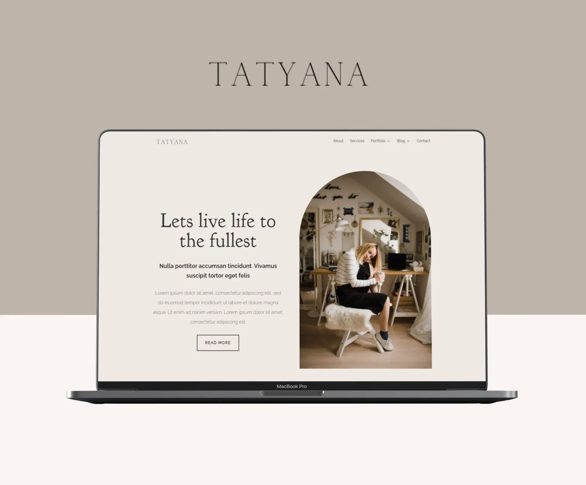
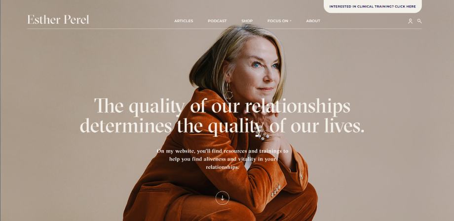
In addition to colors, fonts and images, white space is one of the key elements of web design.
More white space enables the text on your site to breathe, makes your visitor easy to read and tells them where to focus their attention.
The more white space the site uses, the more luxurious the brand seems. So, always think about it!
4. Without long paragraphs
People are burdened with various information from all sides throughout the day and it is no wonder that none of us have the patience to read long texts.
If there is no space between texts, our eyes quickly get tired and we lose interest. That is why the paragraphs must be not long and contain 3 to 4 lines at most.
Just imagine reading long paragraphs on a mobile phone. No way, right?
5. Be careful with colors
It is known that colors talk about you and your character. In this case, about your brand as well.
For example, the red color’s meaning is associated with excitement, emotions, passion and danger, while blue exudes tradition and trust. Pink is mostly used by female-focused brands, and yellow is intended for cheerful and fun brands.
When you study the color philosophy in detail, you should choose the right palette for the website because the right combination of colors is of great importance.
There are many online tools that help us make a good color palette, for example mycolor.space
6. Use a lot of pretty images
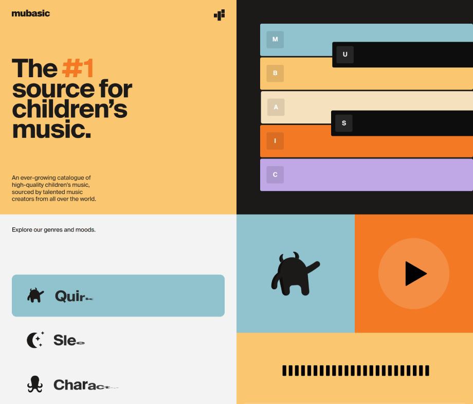
People are visual creatures, so keep their attention with pretty, relevant and high quality images.
It would be best if you could hire a photographer to take photos of you and your products or the way you provide services. That way, your potential customers will see firsthand what working with you looks like.
If you are just starting and don’t have a big budget, there are alternatives in the form of using stock photos. In that case, make sure that the pictures you choose nicely describe your products/services.
Pay attention to the facial expressions of the people in the photos. Your site must exude positivity and the ability to solve your customer’s problems.
7. Less is more
Just like in fashion, it is a good idea to be guided by the motto of the unsurpassed Coco Chanel who said the famous sentence “Less is always more”.
Too much on the site can be scary and overwhelming to your potential clients and visitors. When we say too much, we mean:
too much – fonts
too much – color combinations
too much – text
too much – graphics
too much – keywords…
Complexity repels your customers, so don’t use too much of anything. Sometimes the simplest site is much more efficient and productive!
Did you like this blog post? Pin it to Pinterest! 👇🏻
